Qidam is Android application for people who wish to manage their weight, water consumption and the overall condition of the body. Our team has created the design for Android app and admin panel.
You can see the design on Behance and Dribble.
As part of the project:
- We have conducted interviews, studied similar versions, built up a mind map of the project;
- We have created a prototype, a design concept, a corporate identity;
- We have designed all the display screens and statuses of all the elements;
- We have drawn up performance specifications ;
- We drew the app icon;
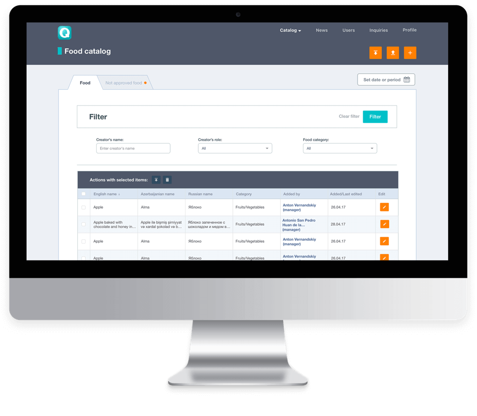
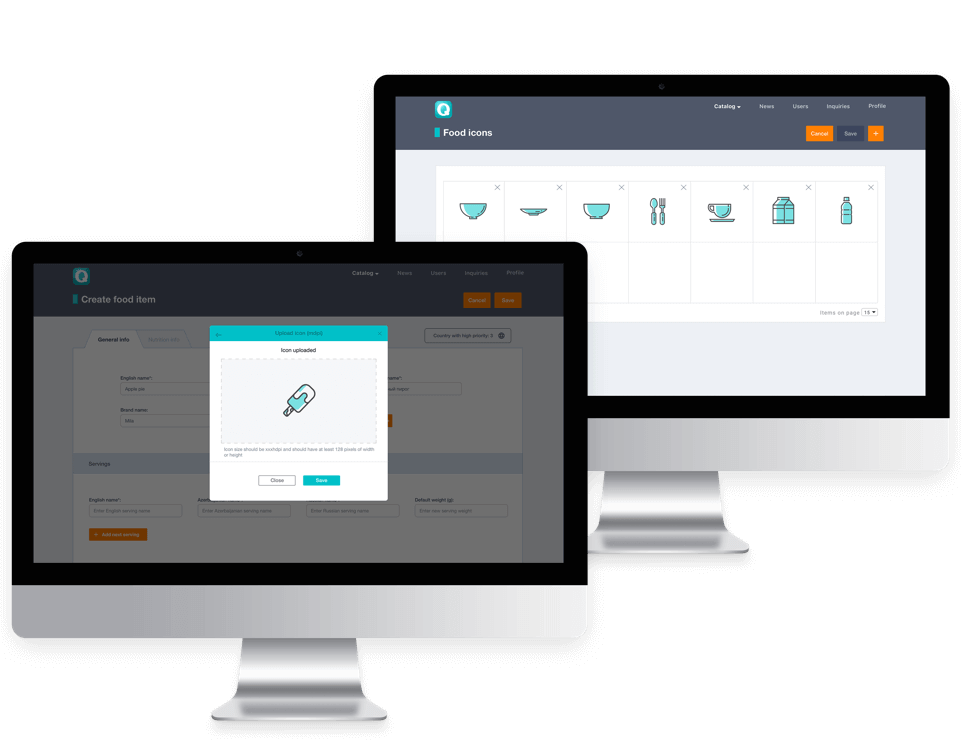
- The design of the admin panel has been completed.
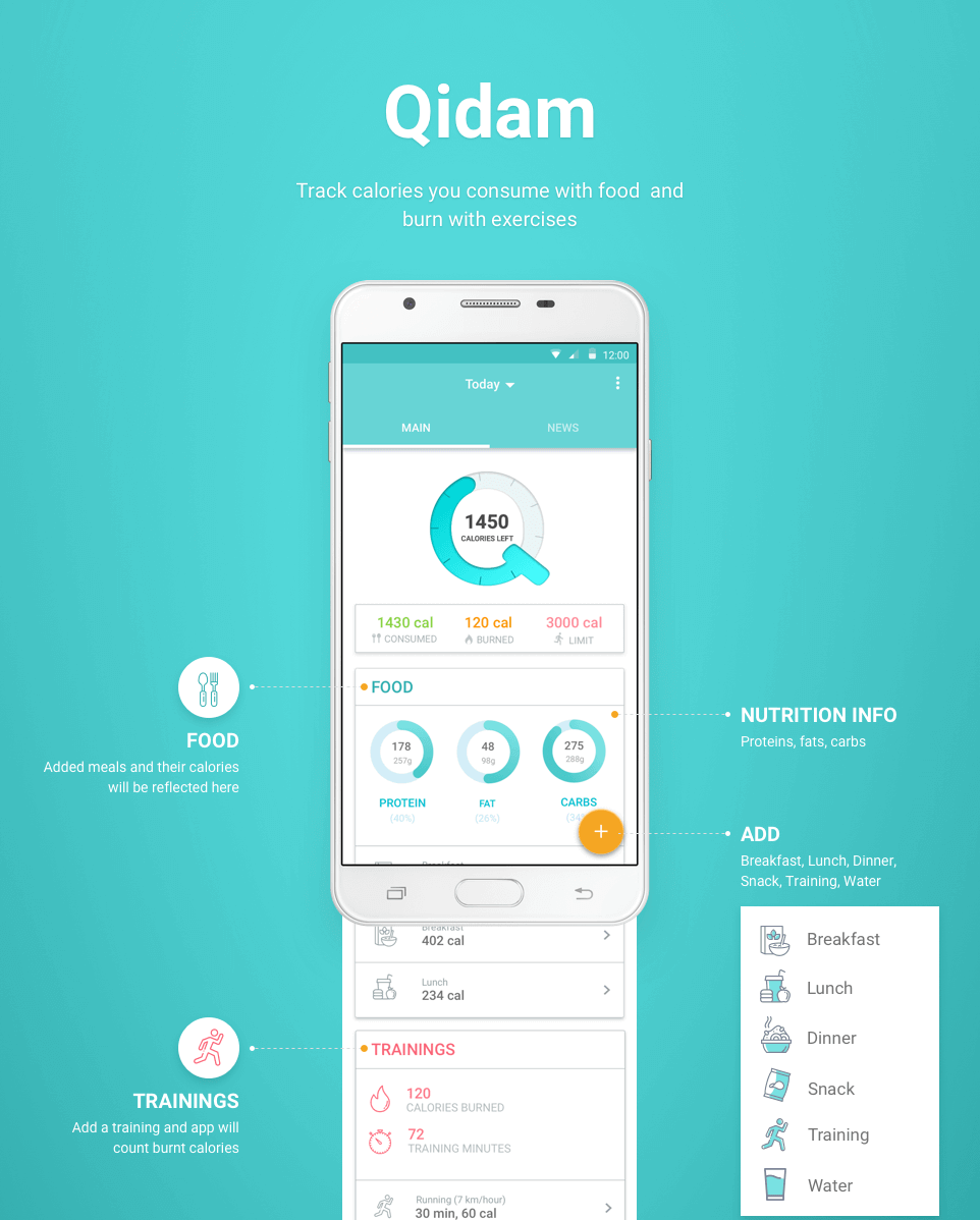
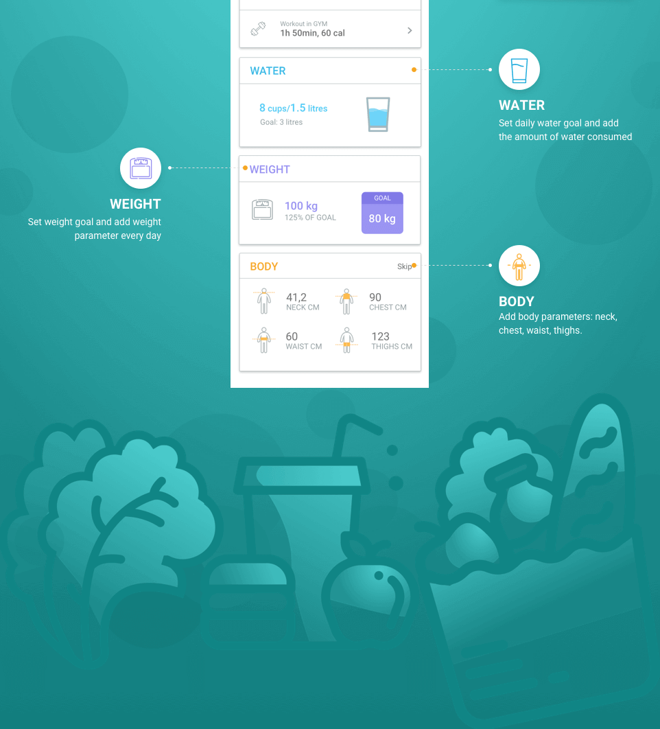
With the app, the following parameters are monitored:
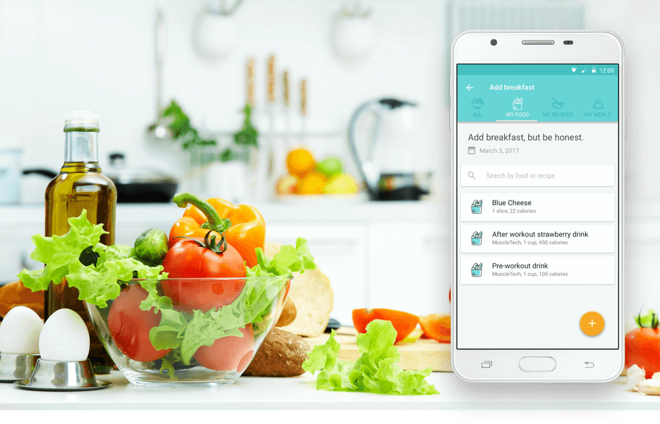
- Quantity of the calories consumed and burned.
- Food intake.
- Amount of the water consumed.
- Own weight and body indices.
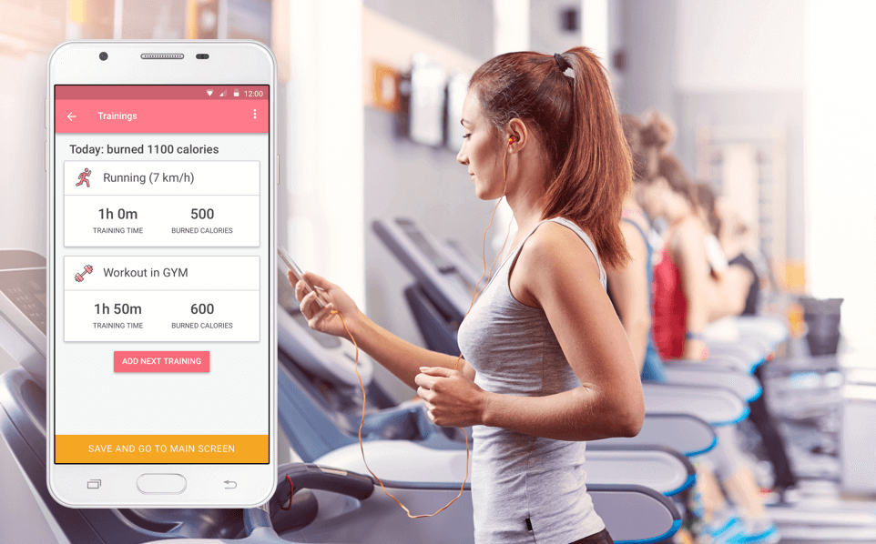
During workouts the app helps to:
- Count the steps.
- Administer the training program.
- Give recommendations based on the analytics.
We analyze the existing applications
There are a lot of apps for fitness, losing weight, healthy diet. We have studied the comfort, the simplicity and attractiveness of the ones which are most popular.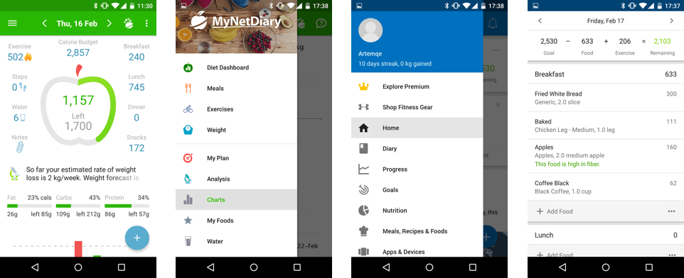
We build up a mind map
We have built up a mind map where all the display screens and links between them are reflected in diagram form.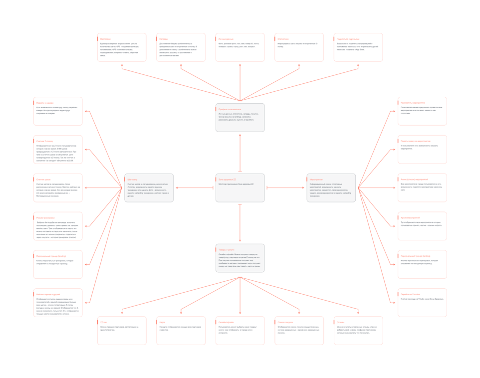
We draw sketches
Sketch is a fast draft of an idea on the paper. It allows to understand if the idea is worth being further developed.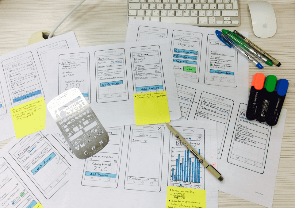
We create interactive prototype
At this stage, selection of color, background pictures and appearance details are provisional or not available. There have been created links between the elements and screens, convenience of the changeover on the prototype.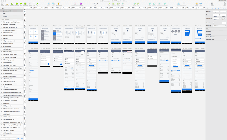
The app will be used several times a day. If at home, or at work, or in the gym, you don’t always have good lighting and quiet atmosphere. That’s why everything should be clear: layout and size of the buttons, the icons, the menu.
For example, filling of the initial information about the user after the registration: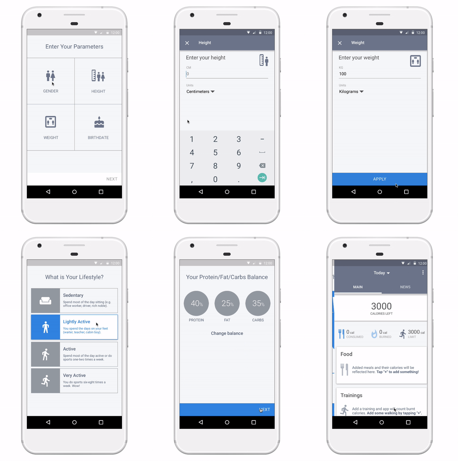
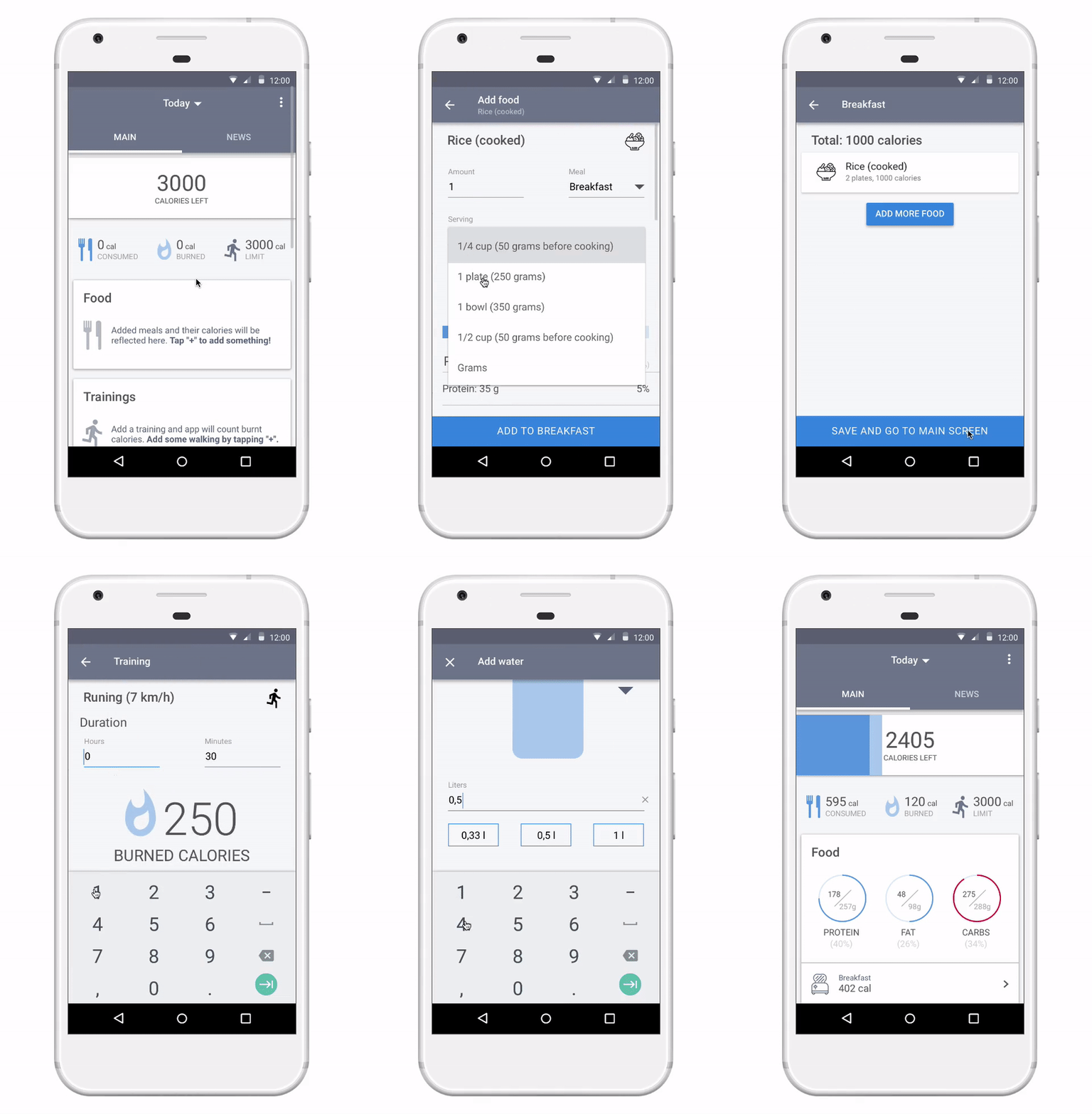
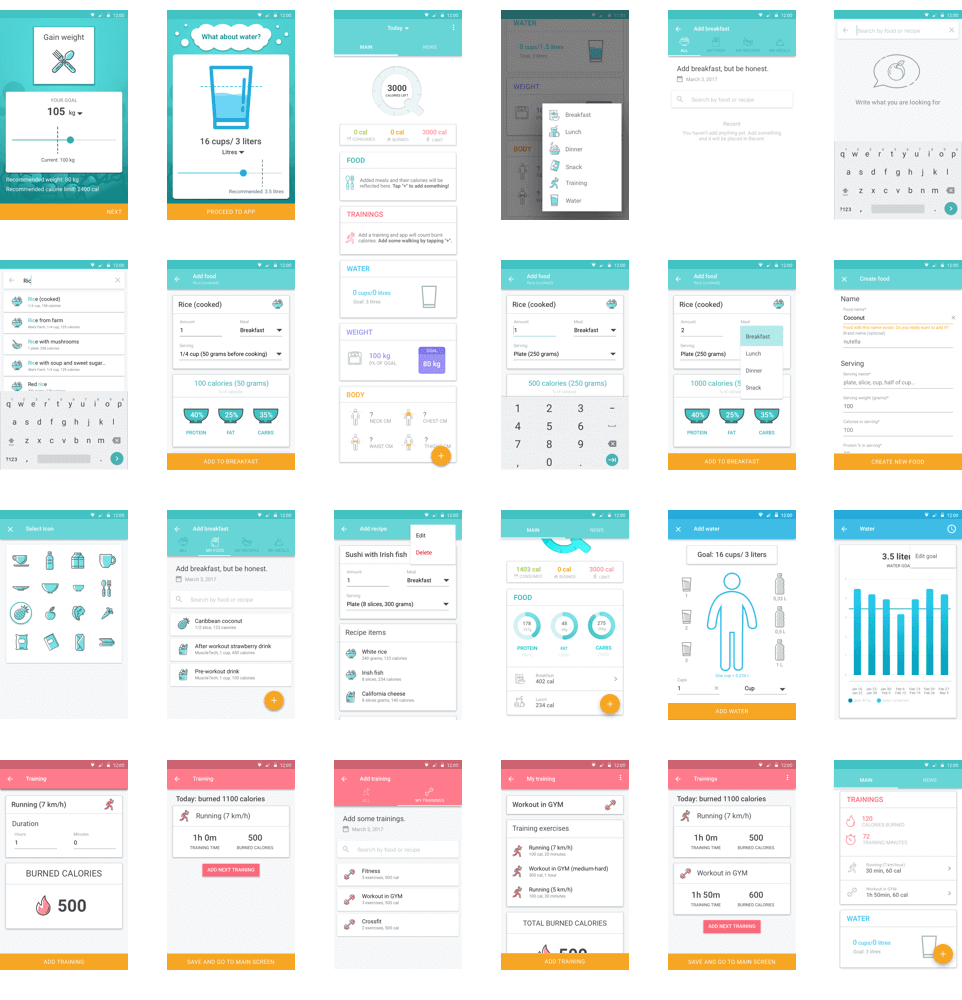
Adding food items to the menu for counting the calories:
Design concepts
We have created three different color concepts of the future app.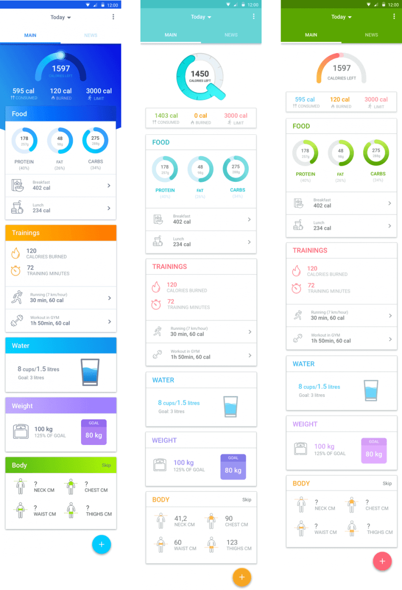
We have selected main colors of the project. The brightest accent colors are used for the following actions: press, update, select. The less bright, neutral colors are for the diagrams and animation.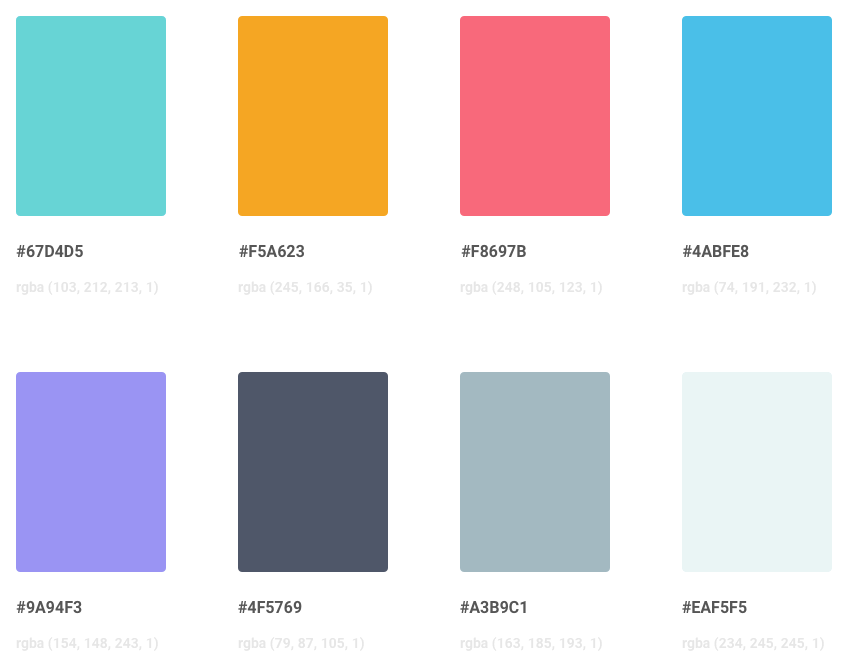
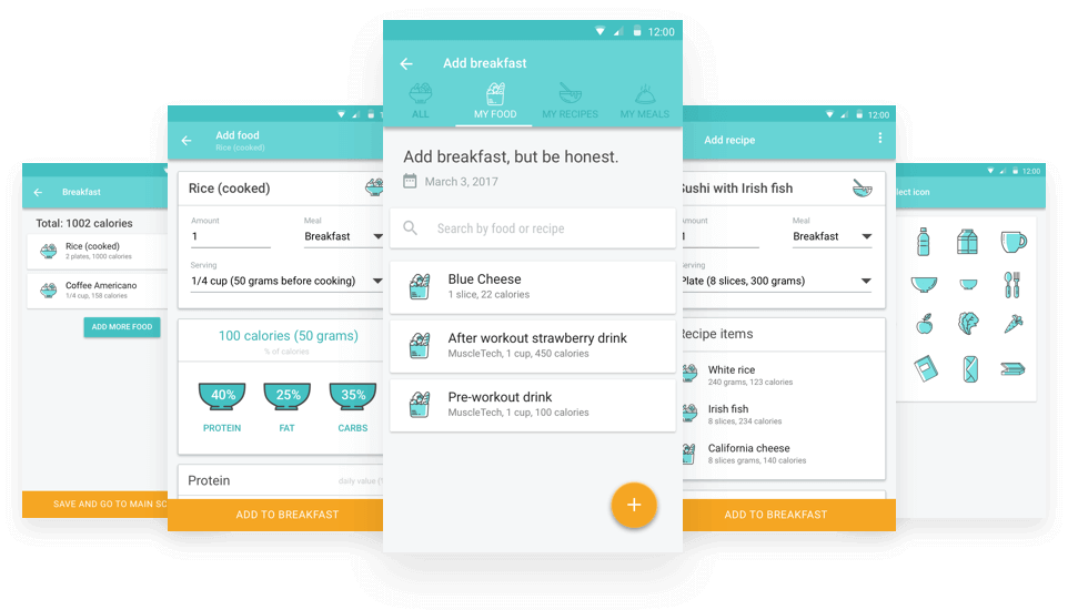
Elaboration of the elements of the Nutrition section
Selection of products for adding to the menu;
Estimation of the caloric content and counting of the product quantity;
Development of the tags for different types of products and drinks etc.
Workouts
Motivation is essential for workouts. The app helps to lose weight. That’s why the calorie consumption calculator has been chosen as a focal point.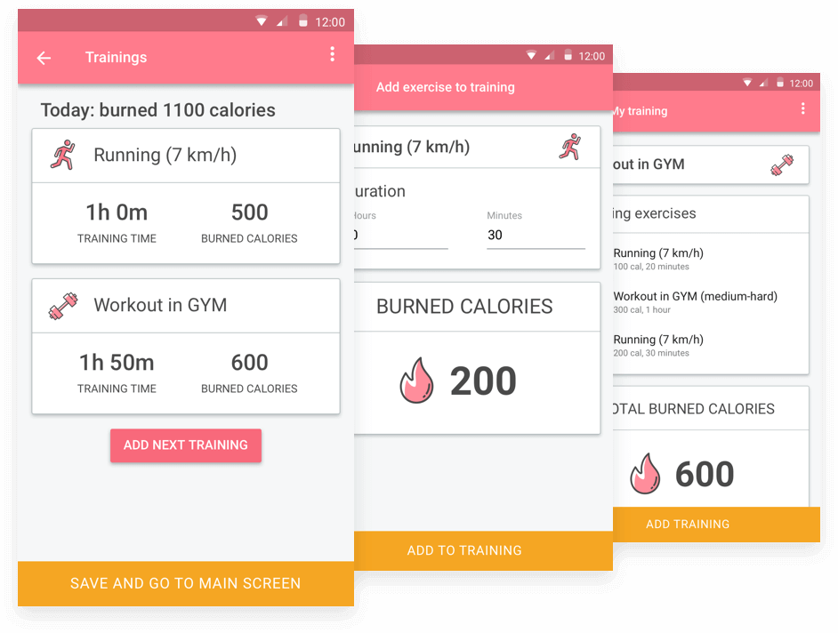
Daily water intake
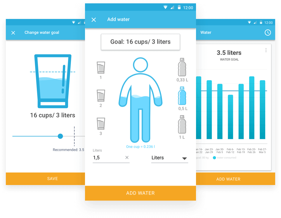
Counting of the water intake is available in the apps more seldom than the workouts or steps/calories counting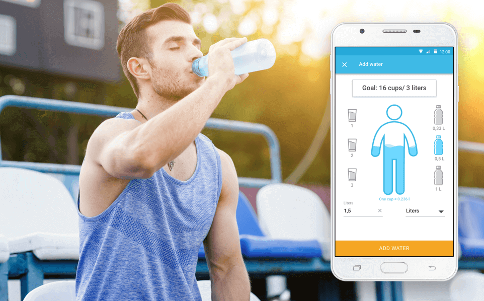
A glass with indication of the normal intake shows the aim in a graphic form (amount of water per day);
Small bottles and glasses demonstrate how much water the user has drunk;
A manikin figure is filled with water as the aim is reached. It’s a visual and motivating variant of the diagram.
Weight and body parameters
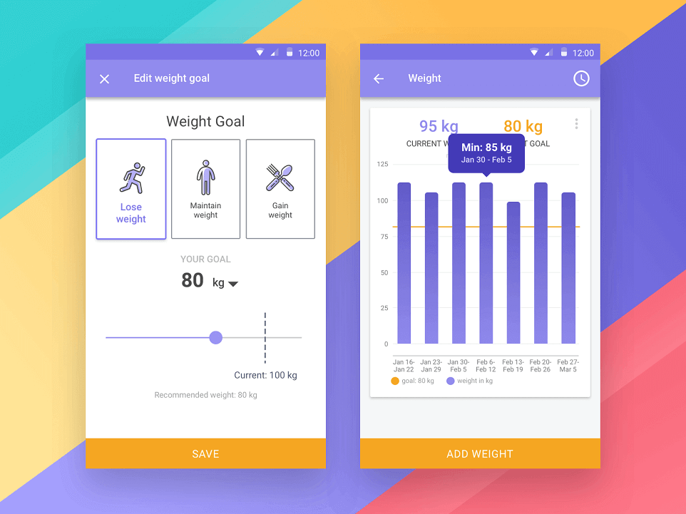
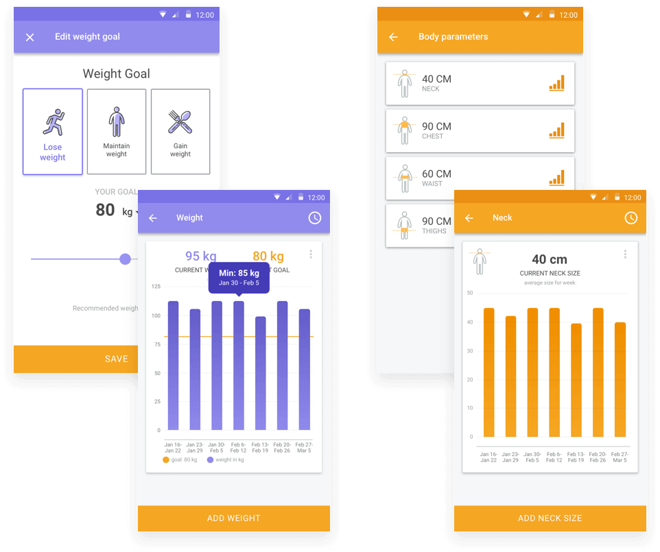
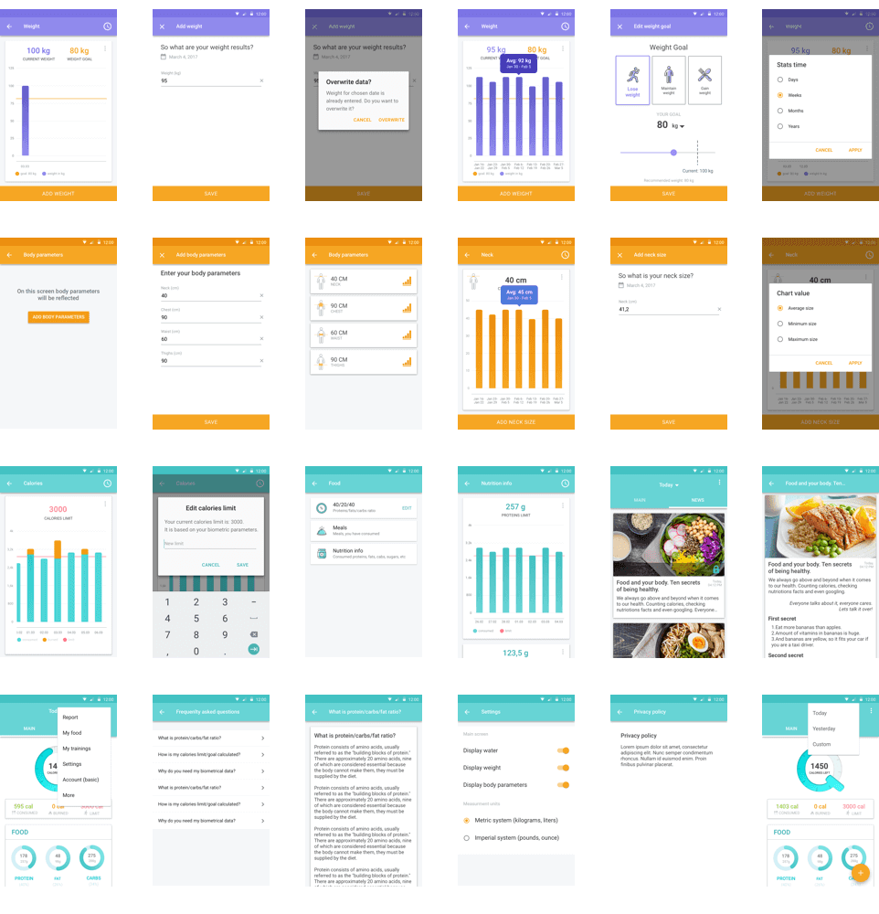
The app keeps record not only of the weight changes, but also of other body parameters (size of the neck, the chest, the waist, the hips). The dynamics of the changes can be viewed on the diagrams.
Design of all the display screens
Prototype and the design concepts have been approved by the ordering customer. Each screen is remained to be elaborated in detail, taking into account the selected elements and the color gamut.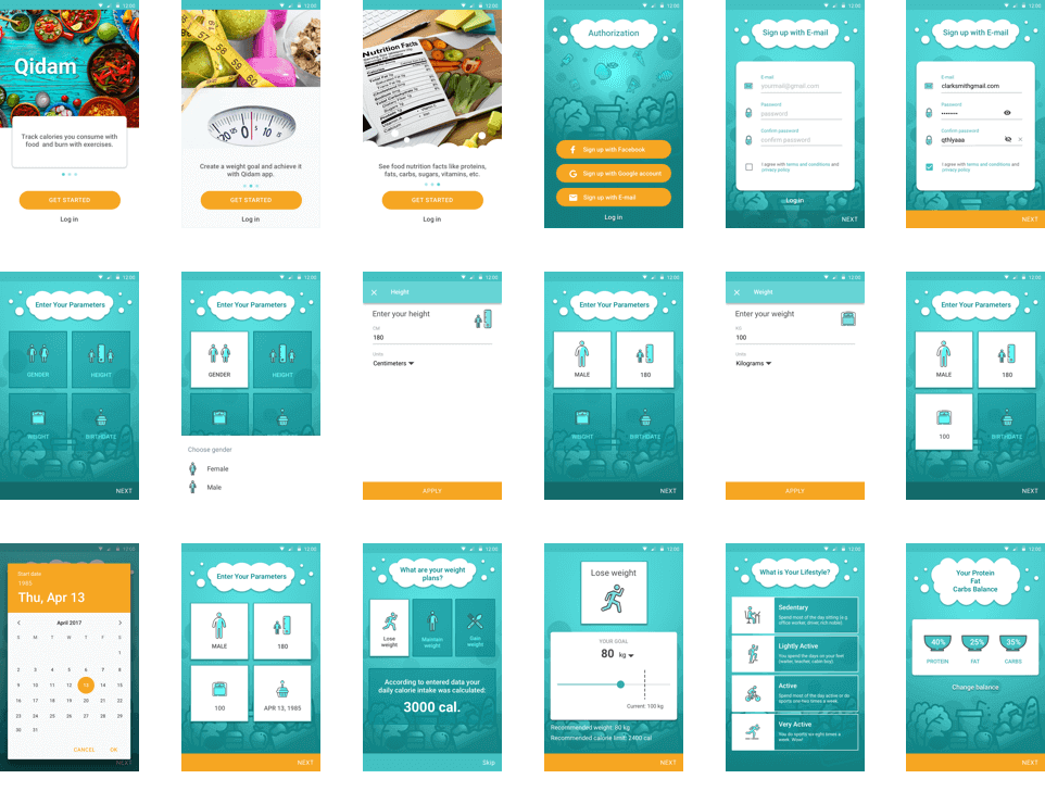
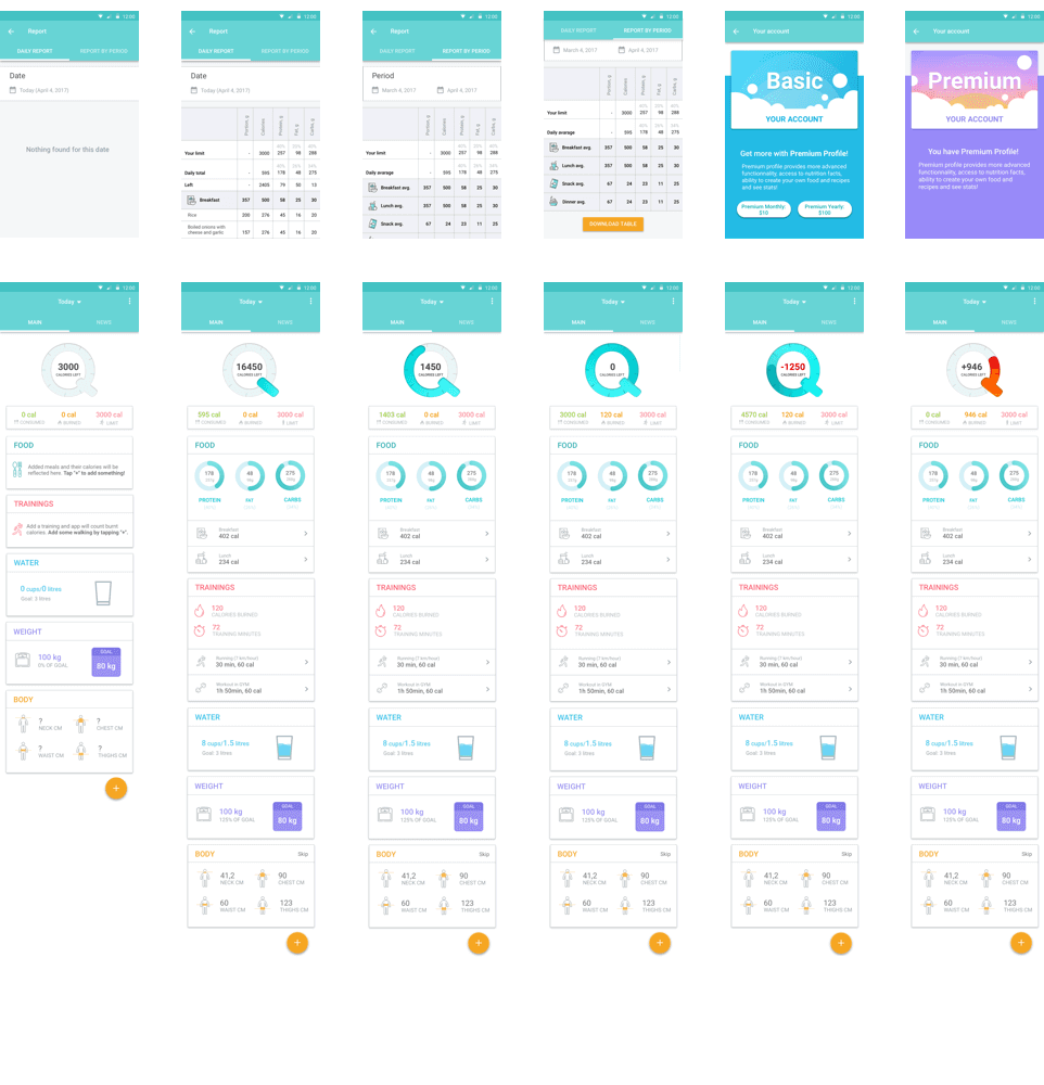
Onboarding
Onboarding explains how to use the app. They can be prompts, tips, system tour navigation. As a rule, they are 3-5 screens of the app viewing for the novice shown only at the first start of the app. They are paged left-right and shall explain the app possibilities as easily as possible.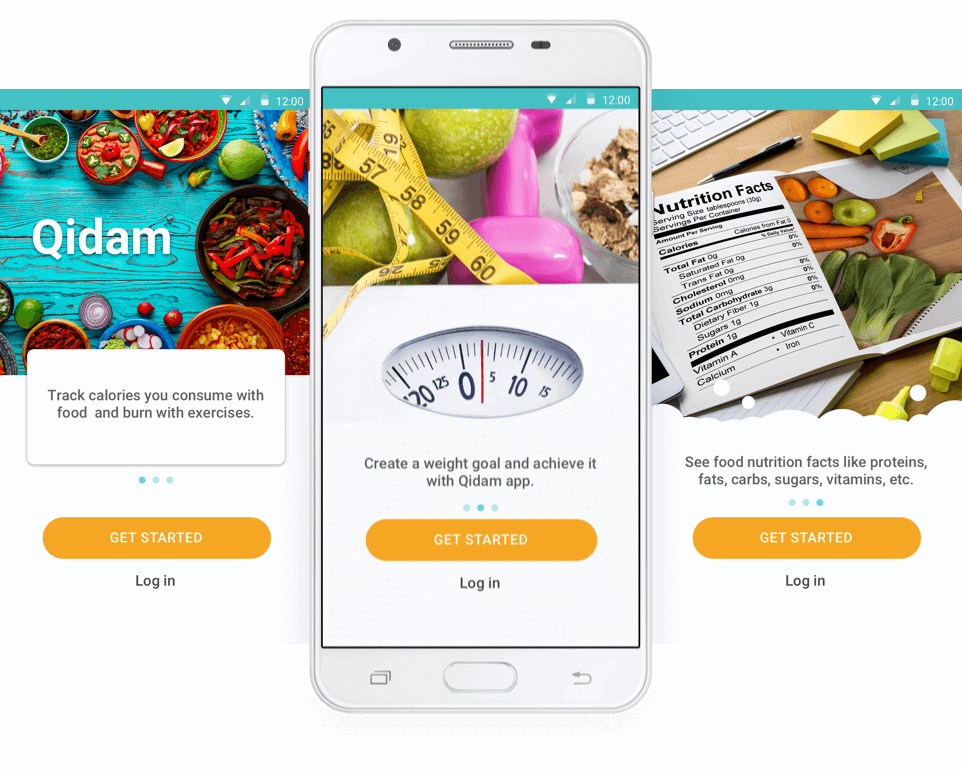
Icon development
Bright, informatory and recognizable icon increases the recognizability of the app in the general list of Google Play store. A commercial success and frequency of downloads and app installations often depend on the icon perception by the users.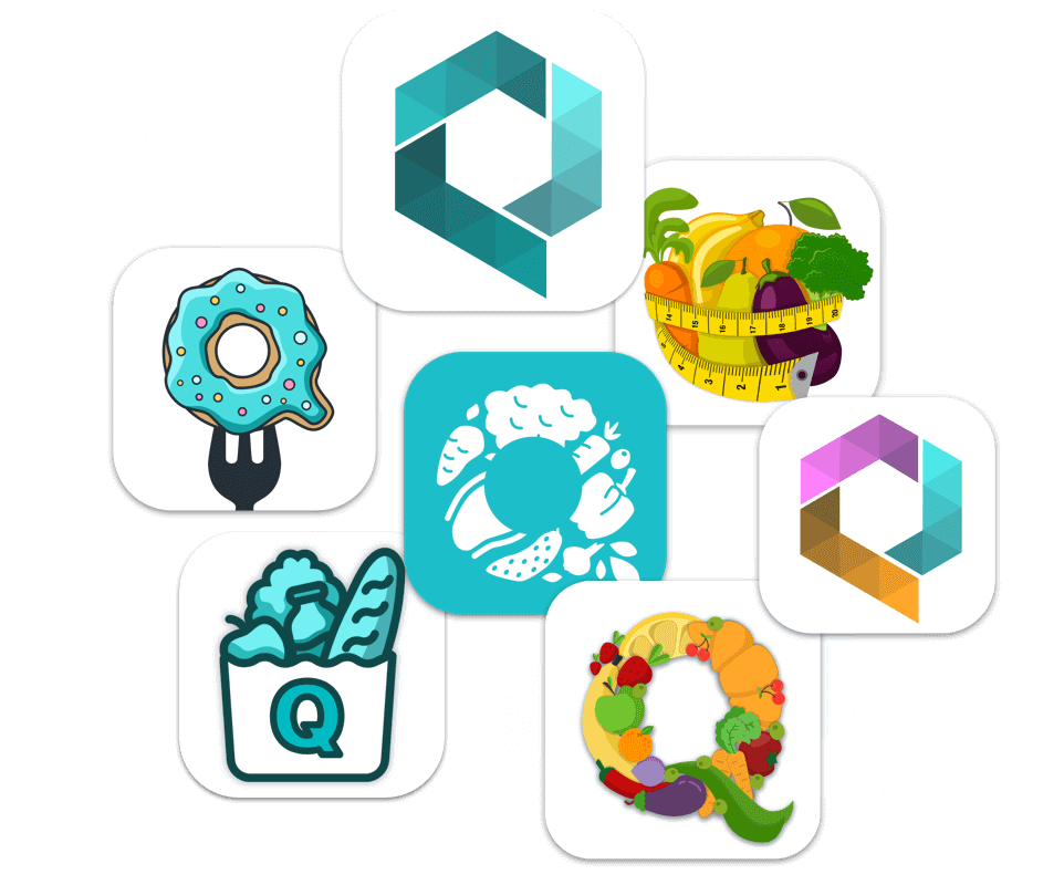
The choice has been made in favor of the letter Q on the turquoise background.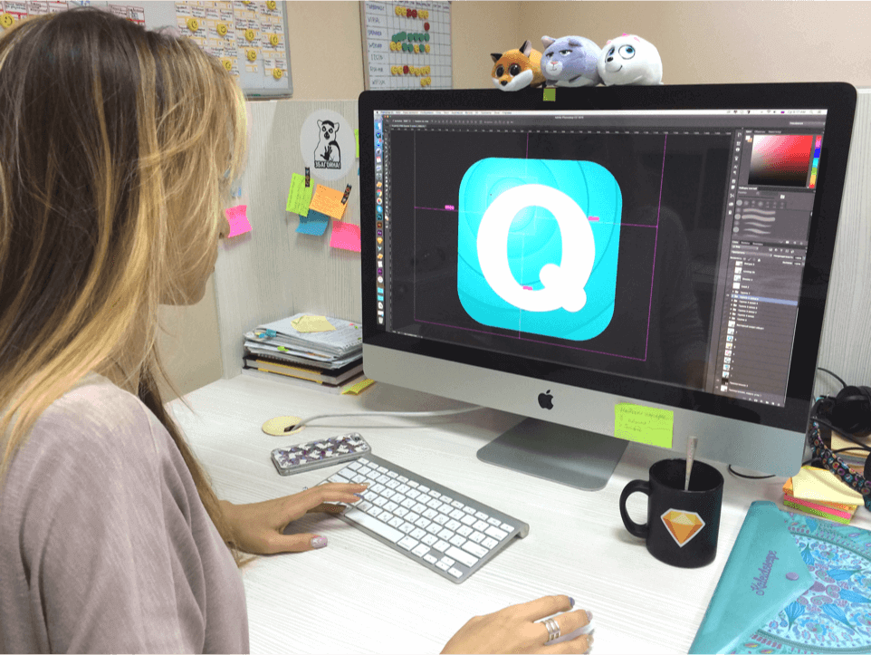
When developing the design, the icons for the menu, informers, buttons have been made.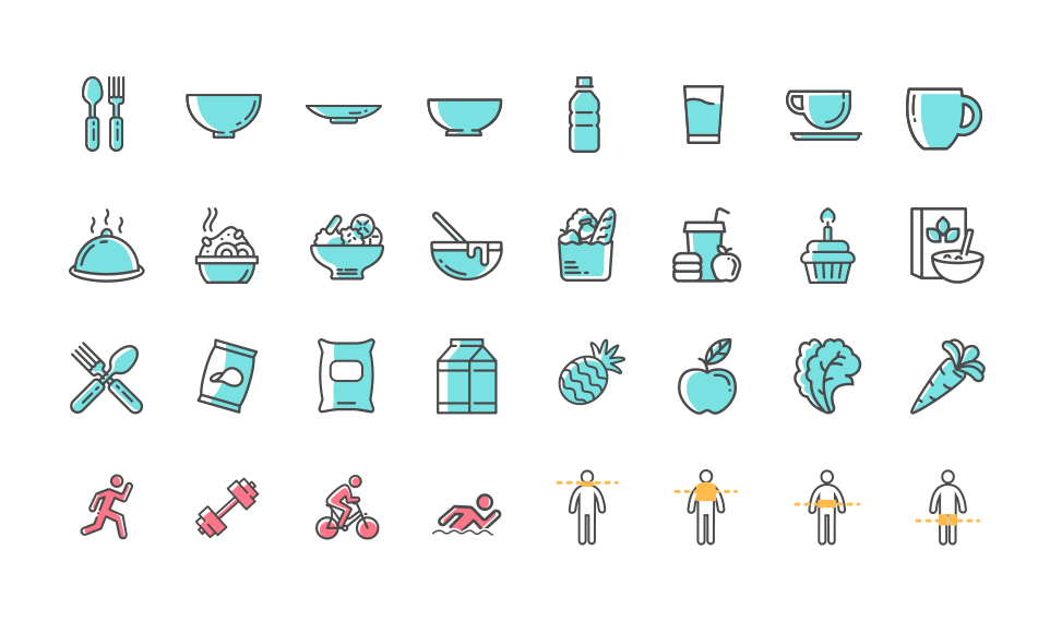
Admin panel
Data received from the users are saved in the database. In order to manage these data the admin panel for moderators is required. The panel design has been created. We can’t disclose information about its functions.