Wi-Fi Space is a free map of Wi-Fi access points worldwide.
What we did:
- Created web interface that helps users to quickly find a desired Wi-Fi spot anywhere in the world.
- Created and integrated a database of Wi-Fi spots.
- Created more than 50,000 pages with cities, countries and Wi-Fi spots that are optimized for search engines.
- Presented a web application for the service.
Website address - www.wifispc.com
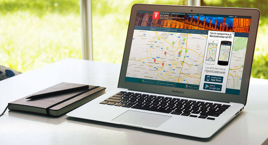
Wi-Fi space is a startup, which aims to provide free access to the Internet worldwide.
The project is designed for travelers and those who are faced with the need to find Internet access in an unfamiliar place.
The service is available through:
- Application for iPhone
- Application for Android
- Website
When doing market analysis, we have researched all large services worldwide that could be seen as competitors.
We noticed that they have different market coverage: some are very active in Europe, others – in the United States, but there were no players who managed to cover the whole world.
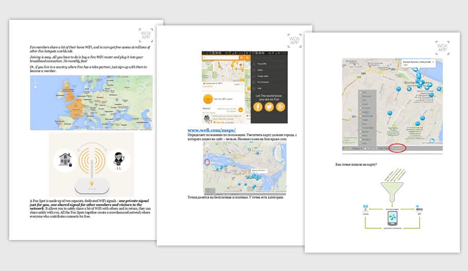
We allocated 3 formats of the competitors:
- Providers that give customers an additional service.
- Websites enthusiasts that collect all the spots without checking and differentiation.
- Companies that collect spots, but work on a database and its quality.
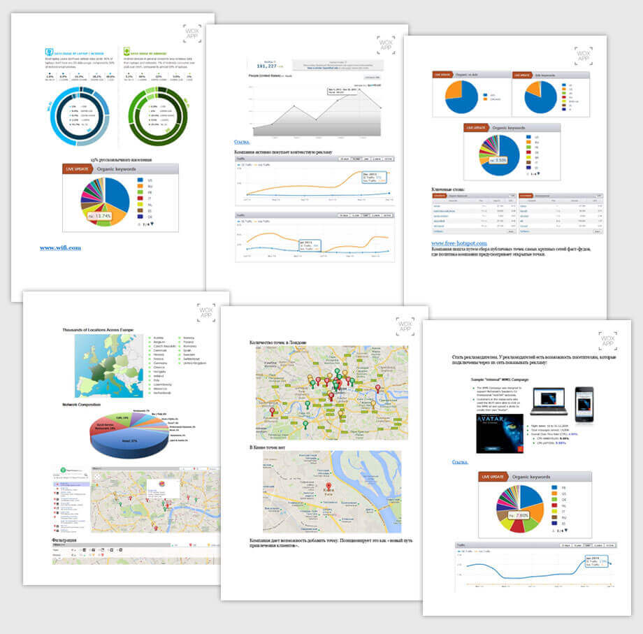
The analysis was put together and presented to the client.

Is the website SEO friendly?
The website is not as simple as it looks. For each major city in the world and most of the countries, we have made a separate landing page based on search queries.
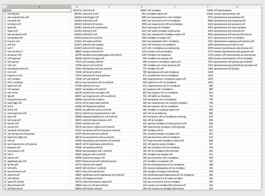
What was done:
- Providers that give customers an additional service.
- Websites enthusiasts that collect all the spots without checking and differentiation.
- Companies that collect spots, but work on a database and its quality.
Those who will be searching for Internet access in Moscow, Warsaw, London, or in Japan, USA, Russia and so on, will find out about us, see the coverage and will be able to download the application on their phones.
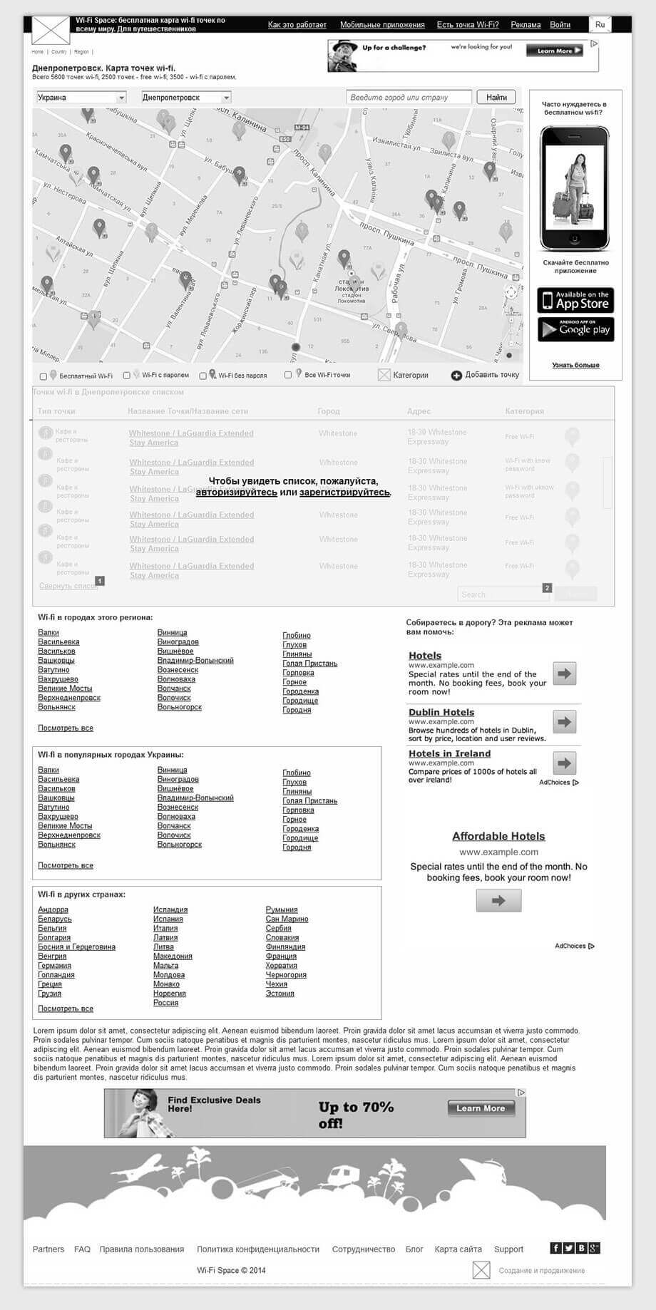
Website prototype
We make a prototype and on it show the placement of the blocks.
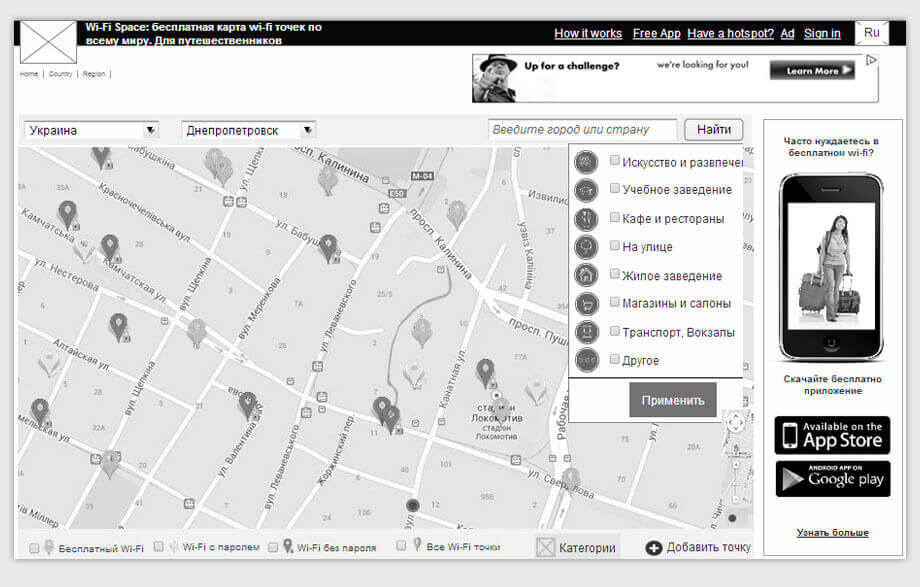
Special attention was paid to the user-friendliness of the map and sorting access points.
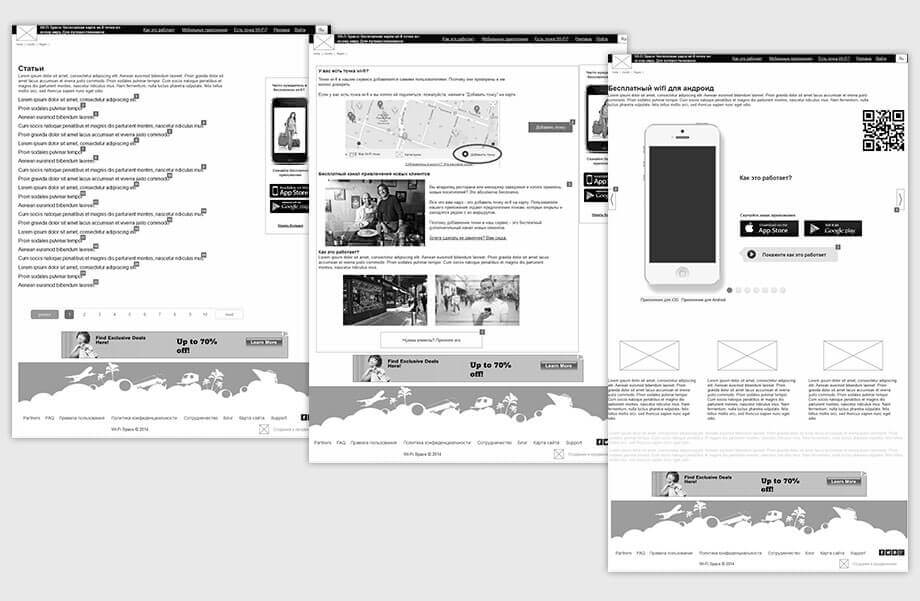
Develop every page, work out each element.
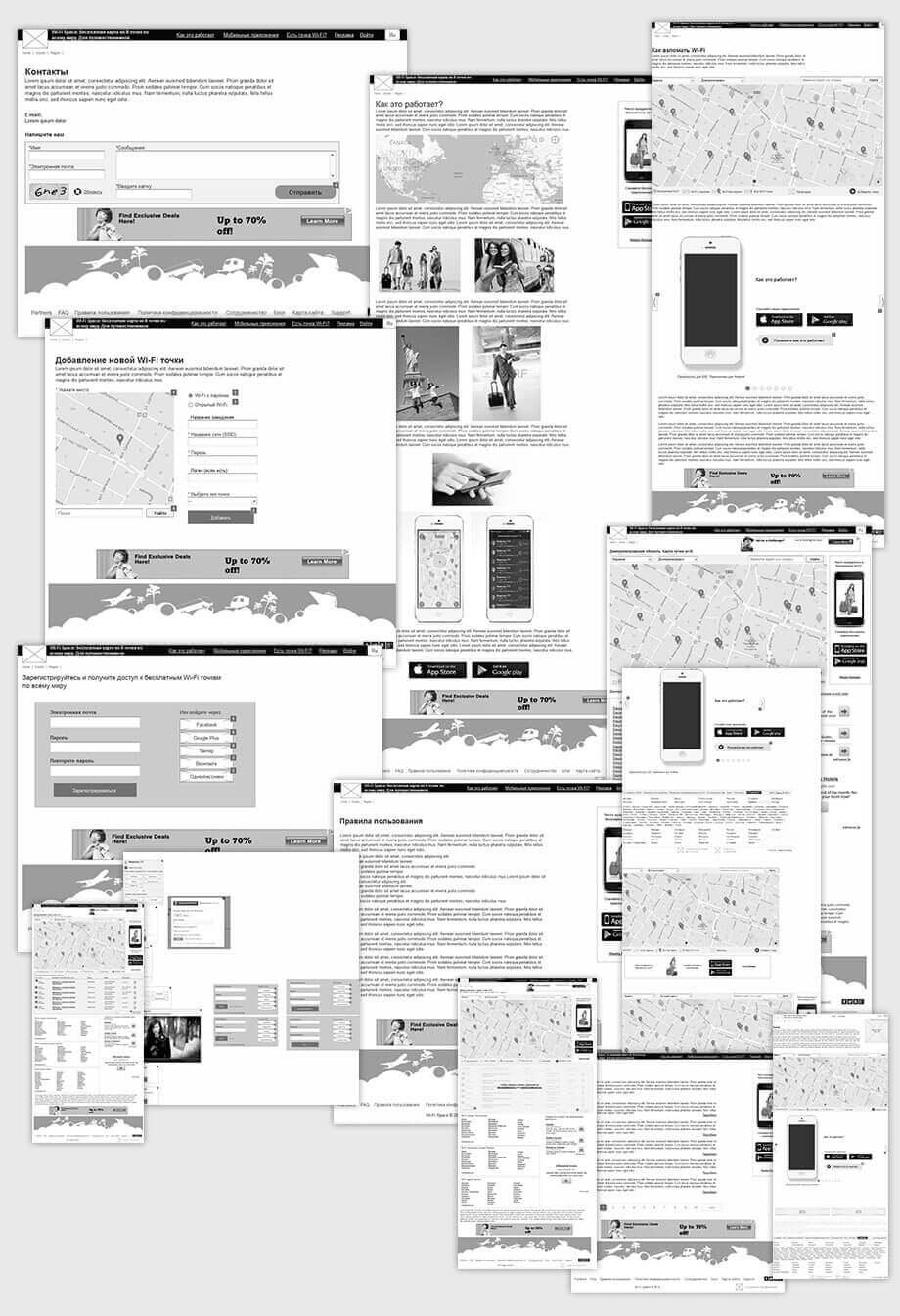
We also took into account that the website was being created for the Russian-speaking and English-speaking users. Therefore it should be as convenient and easy to use for all countries.
Design
Service should be recognizable. That’s why the icons and colors should be the same for all platforms.
In the design we reflected the associations with free wireless access in a variety of places - it increases the memorability.
We start with simple shapes. White background, nothing extra.
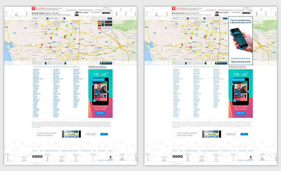
Several options of lower pattern.

We offer a dark version.
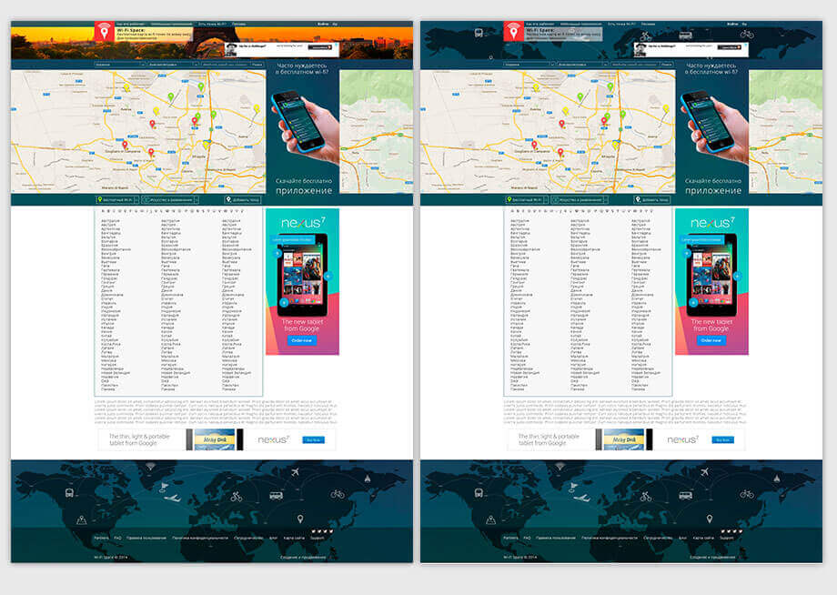
They prefer dark. Let's put on the map at the bottom of the site famous sights.
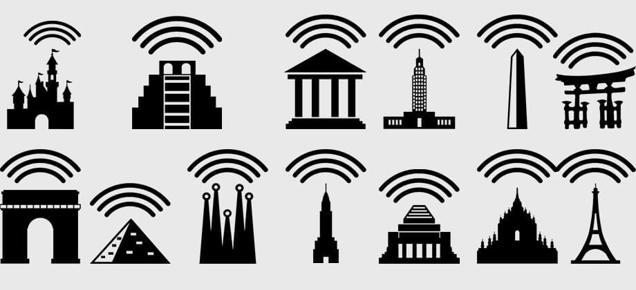
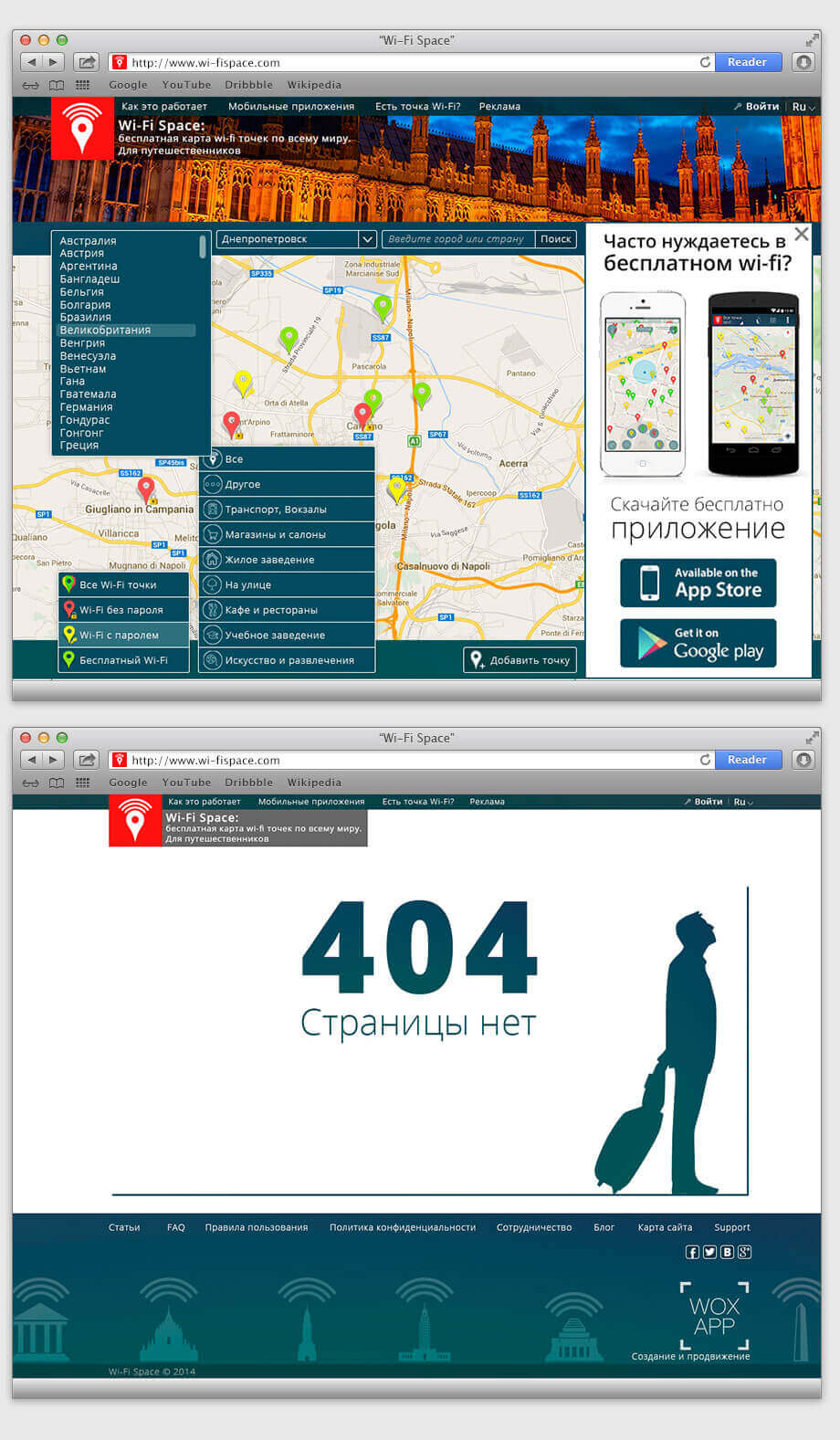
Confirm. Draw out all the pages.

Talk about mobile applications, suggest downloading them
To make downloading of the application easier we added QR-code. Using it, you can go to the download page via a smartphone
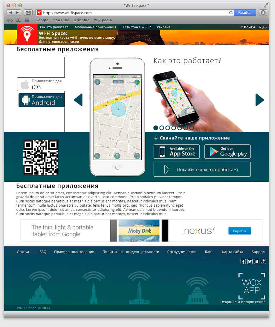
Through the website you can also add new access points.
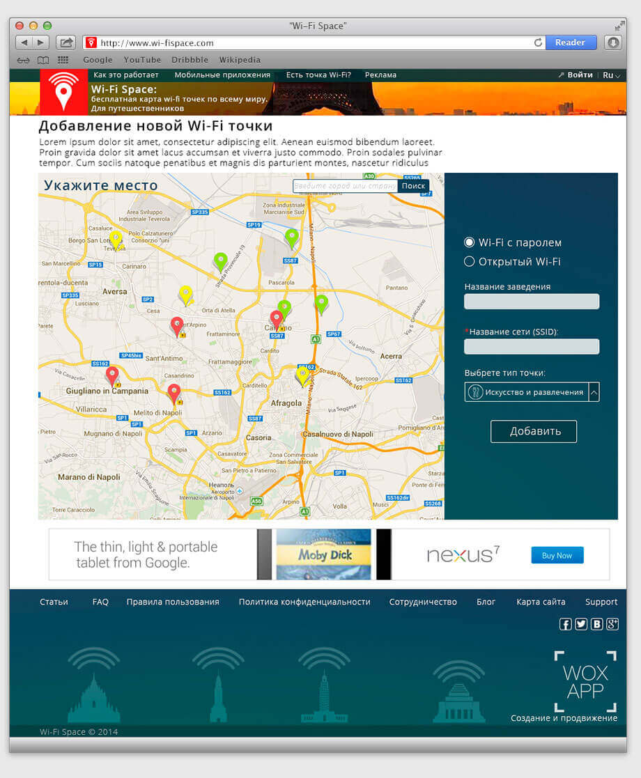
Work on icons and elements.
Programming
Wi-Fi Space allows users to share known wireless access points: that is, they can add to the database and edit it. Working with a database that has hundreds of thousands of access points and tens of thousands of pages is a complicated matter.
We had very high demands with regards to the loading speed of the site, database update and the usability of the site.
At the same time, the site should work in tandem with the two applications, which also have hourly updates of their databases, adding new access points, etc. It took us a long time to connect access points to the pages, and required quite complex engineering solutions.
Programming took most of the time.
We have written texts for static pages, pages with cities and countries. We’ve filled out the entire structure of the site, which is necessary to service the users.
Review from the client
Requirements of our clients at the stage of project evaluation
- Successful experience in projects development for medium and large businesses.
- Business expertise in the development of start-ups.
- A team of 7 or more specialists for application development.
- Uniqueness, no standard solutions.
- Term - development from 3 months.
- Transparent control system and flexibility in application development.
- Justified cost for mobile app development.
People who worked on the project:
Project manager: Yulia Povar
Designer: Egor Tkachenko
Internet marketer: Lyalin Maxim
Web Engineer: Karpikov Petr
Web Engineer: Zavorotinskij Maxim
Technical director: Dmitry Moskalenko

