By using an example of Sleep Keeker application we will show you how app development is carried out in our company and what you should expect if you choose to create an app for iphone with our team.
Sleep Keeker - another mobile alarm-clock application?
We believe that hard work and not just ideas help create great things. That is why, when we were presented with a task we took it and ran with it.
"Yes, we know that the market has hundreds of applications-alarms. But try to find what is missing and make a suggestion”
Setting the goals and analyzing competition
We started analyzing all the alarm clocks, which we could find. In our company this is done by a UX / UI specialist.
We look at user behavior, at what type of applications are out there, whether they are user friendly. Of course, we also carefully study the reviews about the applications, because they contain a lot of useful information.
We analyzed dozens of alarm-clock applications.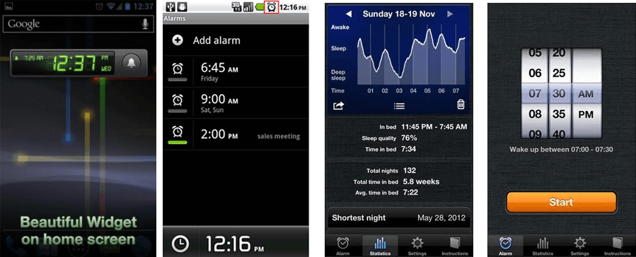
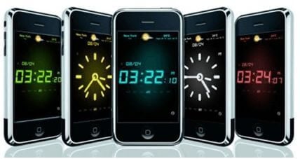
All user reviews were collected and cataloged.
We noticed the most unusual functional elements:
- Waking up by alarm shaking;
- Puzzles and quizzes to unlock the alarm;
- Connecting the radio for a wake-up call.
Developing design for application
By keeping all of that in mind, we started designing an alarm-clock and creating the flowcharts (also called "mockups").
At the first stage was a LOT of ideas and questions: "What functional details should we keep? Should we have puzzles to lock the alarm? What need do we target? What do users really need?"
So first we decided to make the alarm clock with all possible functionality, and then during the phase of polishing flowcharts to get rid of all unimportant details.
What did we “squeeze” into the first version of the application?
Initially, we were playing with different types of alarm clocks, the simplicity of moving the alarm to another time zone, wanted to be able to set the alarm in one motion.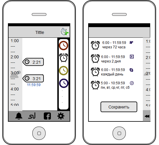
Here, we are testing different “switch off” options. Among them were the puzzles, math problems, and even games.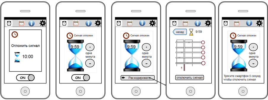
Here we are working on adding signal functionality. That does the user wants? His own tune? Does he want to cut out a piece of song he likes for his alarm? Or maybe he should be woken up by the radio? All ideas are written down and put into flowcharts.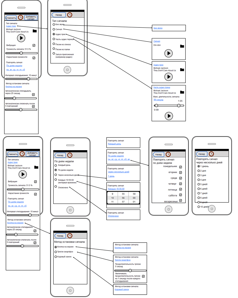
During another team discussion our marketing specialist had an idea:
"Let's show friends who got up at what time! If I knew that everyone can see when I get up, I would start getting up earlier!"
And so we did it :)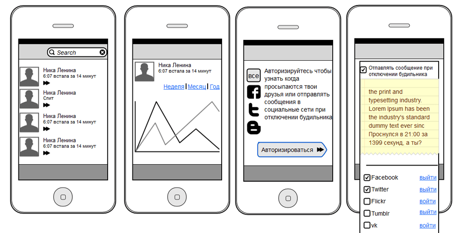
Another idea, which was included in the main version, was the chart of waking up. Why? We set an alarm clock and get up, set it and get up, again and again... But how and at what time did we get up during the whole month? How can you monitor your rate of awakening?
There are people who want to get up at 6 am, but they snooze for 10 minutes, 20, 30 ... and so on. This chart will show whether or not you get up at 6 or just tell your friends about it.
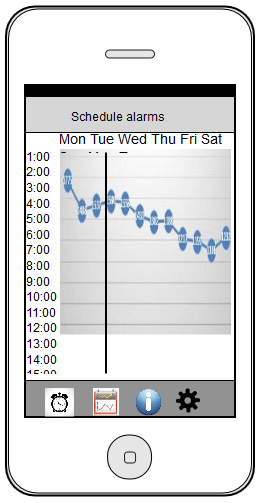
So we sit down and look at what we have. The alarm clock had more than 40 functions! We start to kill the ones that are unnecessary. Cut your own tunes? Later. Wake up to the radio? Later. Time scale and different types of alarms? Later. And so on.
What we kept:
- Easy to use and familiar interface of an alarm clock;
- We liked the idea of social networks (to be able to see when your friends get up);
- Awakening chart.
We approve flowcharts and think through all the scenarios of user interaction with an alarm clock.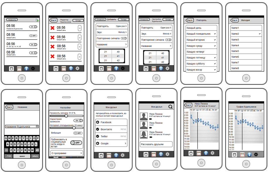
When we finalized the flowcharts, we began developing the design of the application.
Design
There were two options with the direction of the design. First – to create an unusual design with the hope that there is an audience out there who will fall in love with the application for its design.
The second option was to create a "native" application design, which is familiar to a typical user.
We chose the second option, because it allowed us to focus on the functions of the application, its usability and most importantly - the value of using it. At the same time, the design accelerates the process of interaction between the application and its user
Do not forget about the guidelines (these are the official design requirements from the Apple Company), which were not yet in effect when we were developing the design of the application for iOS 7, they only released a beta version then.
We have closely followed trends and could see where the trends in programming iphone apps were moving.
Take a look:
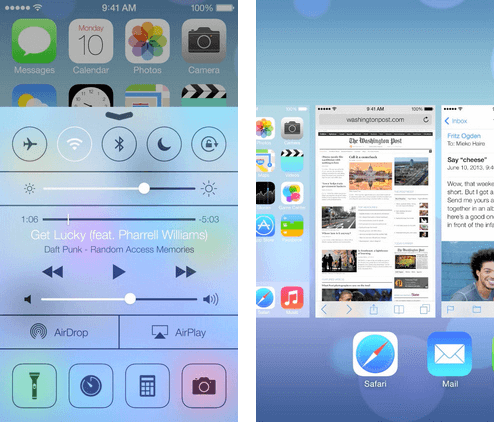
That is why the task became more complicated. The new version of iOS came out and no one knew exactly what requirements will be placed on design (plus new animations and other things).
For example, in the new version of iOS the developers actively recommended NOT to use the branding of applications. Can you imagine? It meant that you could not put a company logo or other brand signs.
Knowing or guessing about such nuances, we began working on the design of the application:
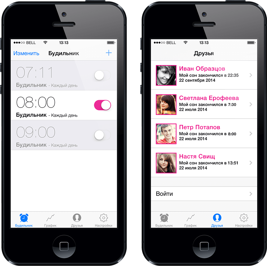
Development begins
From this point the program development of an application begins.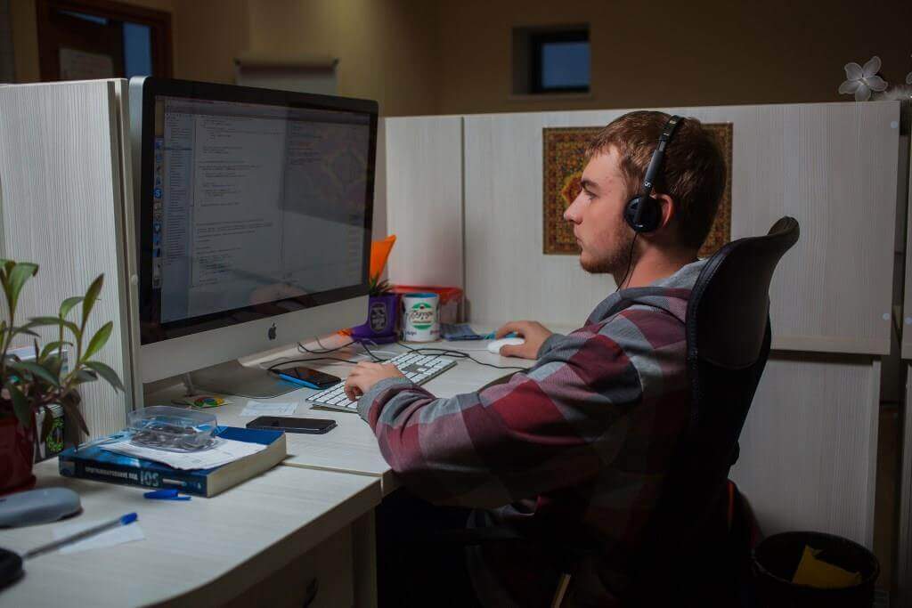
It looks like a simple alarm clock, but actually we had to make a lot of decisions every day. Integration with social networks, the same user in different social networks (how do we add him into the database and verify that it is him?)
In the end we managed to pull it off!
So we began testing the application. For that purpose our company owns different phone models with different operating systems:
We described to you in detail how we create mobile apps in our company so that you could see our approach and all the benefits of working with us.
Requirements of our clients at the stage of project evaluation
- Successful experience in projects development for medium and large businesses.
- Business expertise in the development of start-ups.
- A team of 7 or more specialists for application development.
- Uniqueness, no standard solutions.
- Term - development from 3 months.
- Transparent control system and flexibility in application development.
- Justified cost for mobile app development.


